The challenge
Tremodi Solutions serves small and medium-sized businesses facing enterprise-level security and technology problems without enterprise-level teams or budgets. The brand needed to communicate real technical depth, veteran discipline, and faith-driven integrity without looking like another generic corporate MSP. It also had to clearly hold two sides of the business—cybersecurity and IT—inside one recognizable system.
The response
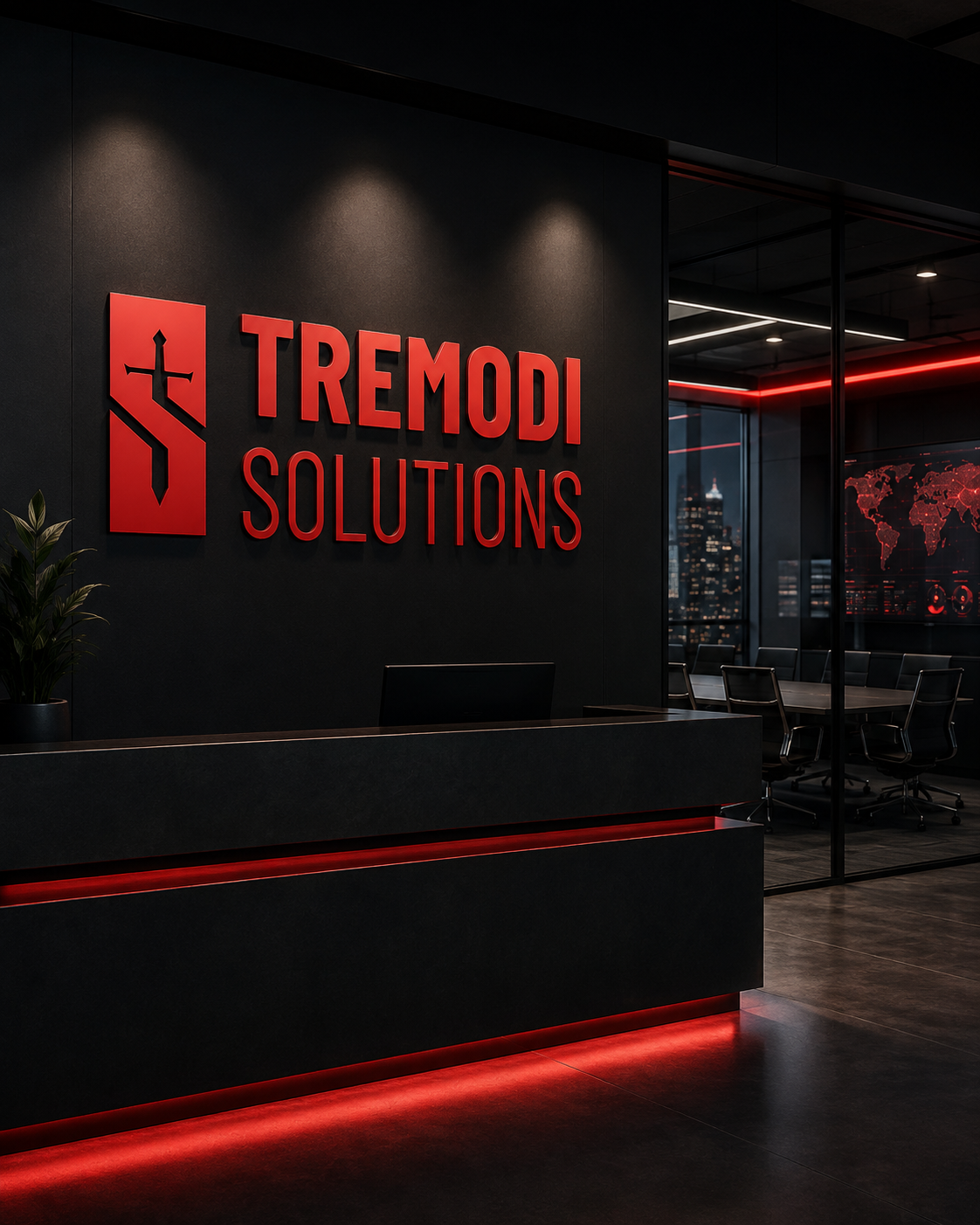
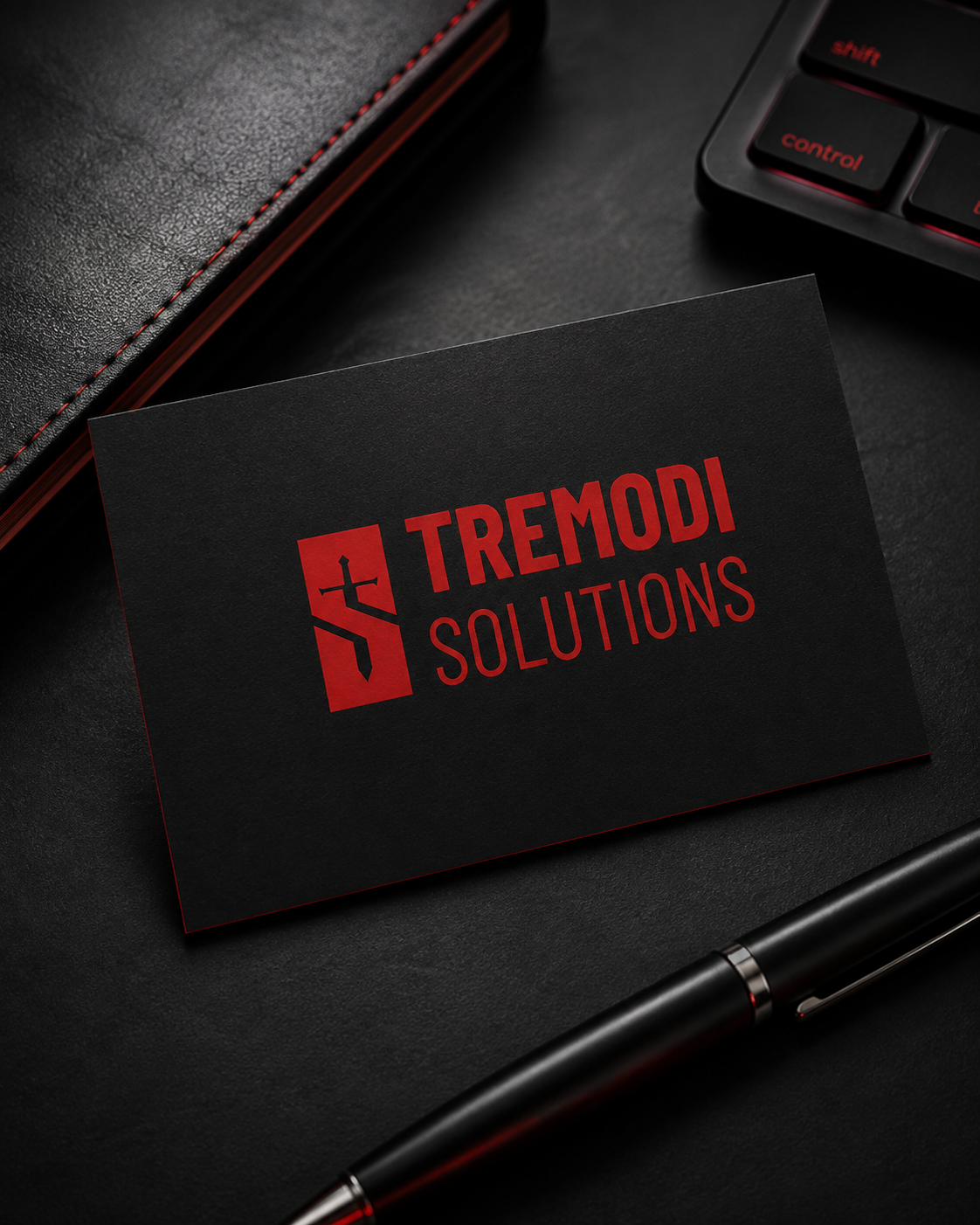
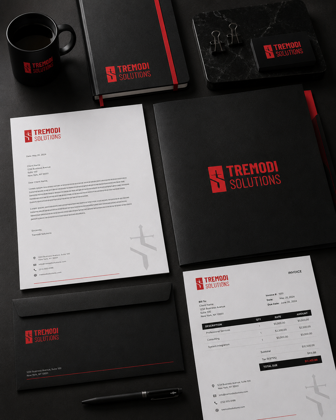
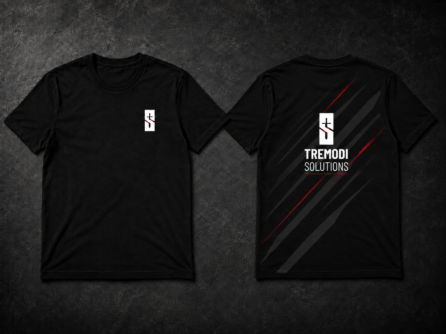
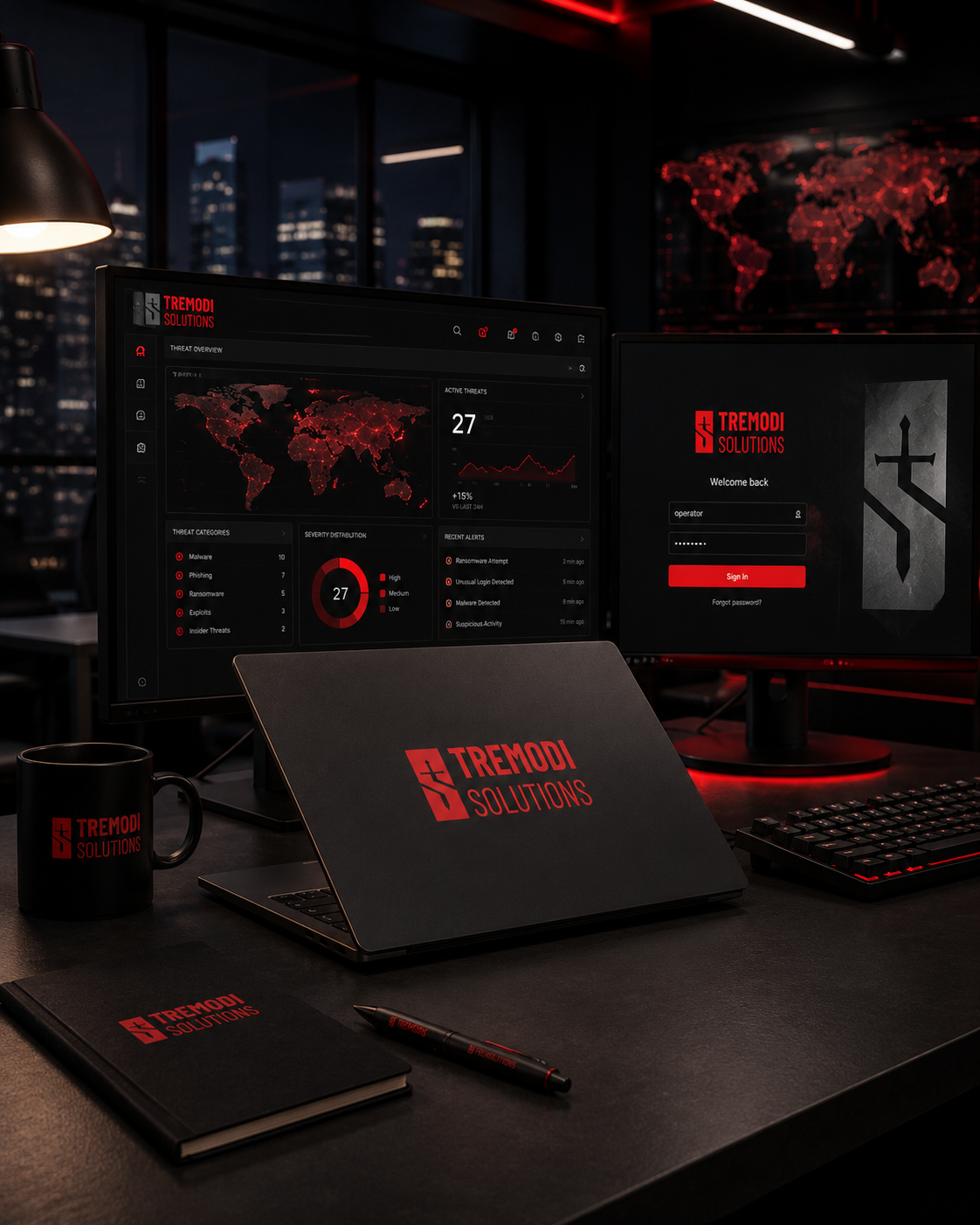
Built a full identity around a sword-shaped T with an S formed through negative space, creating a compact mark rooted in precision, protection, and mission. The color logic became part of the system: red for offensive and defensive security, blue for IT and technology, and near-black as the visual foundation. The identity was then carried across logo lockups, guidelines, business collateral, digital applications, and apparel with a direct, high-contrast visual language.