SELECTED WORK / 02INDEPENDENT CONCEPT · PACKAGING · ILLUSTRATION

Sip
Society

Packaging designed for the conversations that outlast the bottle.

Role: Packaging & Brand Designer · Independent concept

Packaging DesignIllustrationPrint PrototypingArt Direction
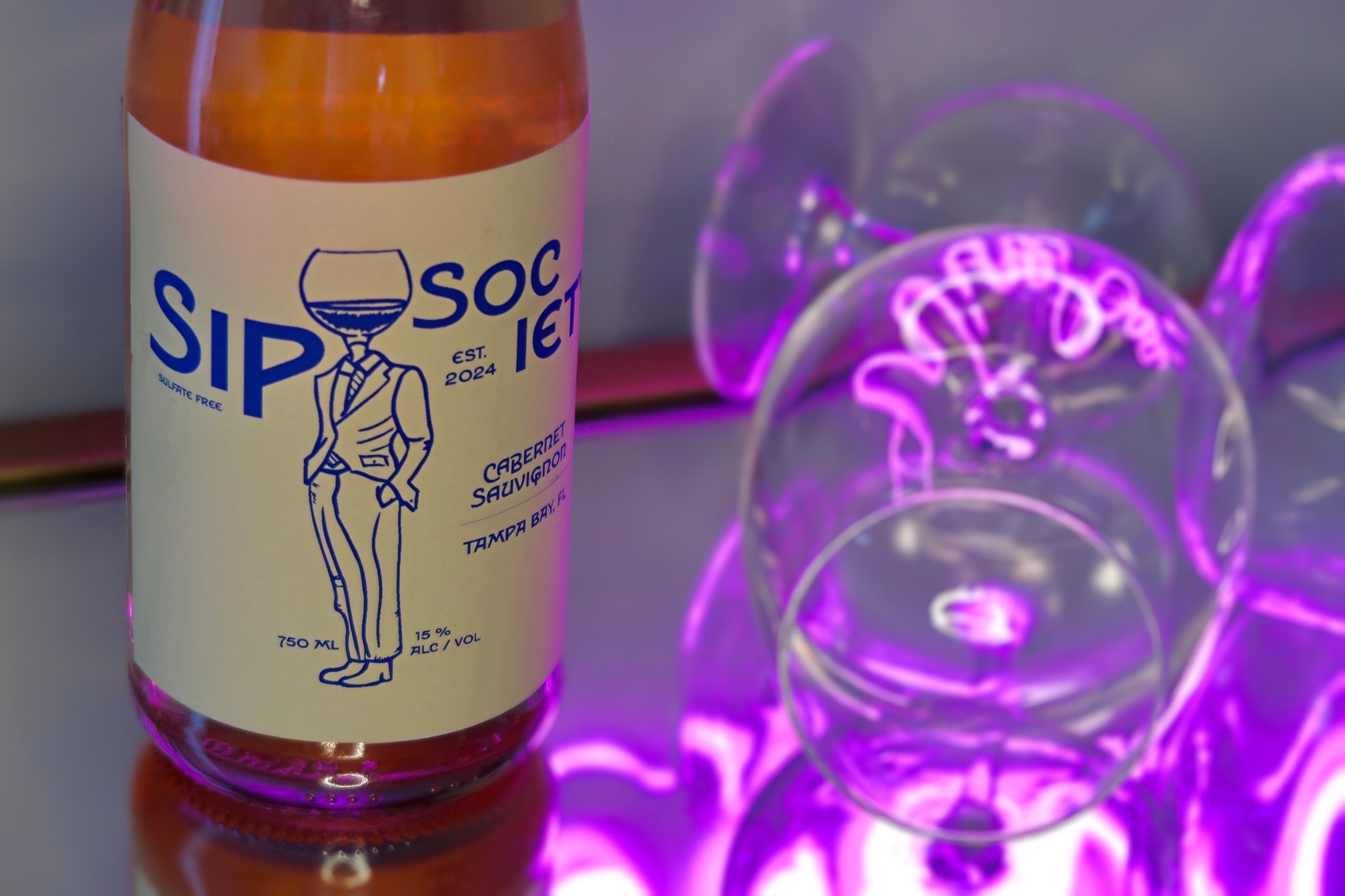
Sip Society wine bottle packaging photographed beside glassware in neon light.

The premise

The challenge

How do you make a wine label feel elevated without making it feel exclusive? Sip Society needed to sit between two familiar category extremes: traditional, heritage-driven wine packaging and highly decorative trend-led bottles. The opportunity was to create something with shelf presence and personality that still felt sophisticated enough for the kind of gathering it represents.
The opportunity

Rather than building the identity around expertise or status, the concept reframes wine around participation. It is for adults who value community, conversation, music in the background, and the kind of evenings where nobody is rushing to leave. The bottle becomes an invitation into the evening—not simply a container for what is inside.

Audience insight

Designed around the ritual, not just the product.

Sip Society speaks to socially minded adults in their mid-twenties and beyond who care about depth, presence, and community. The design treats wine as part of a larger ritual: gathering around a table, putting on jazz, staying for another story, and letting the evening unfold.

“The bottle becomes an invitation into the evening.”
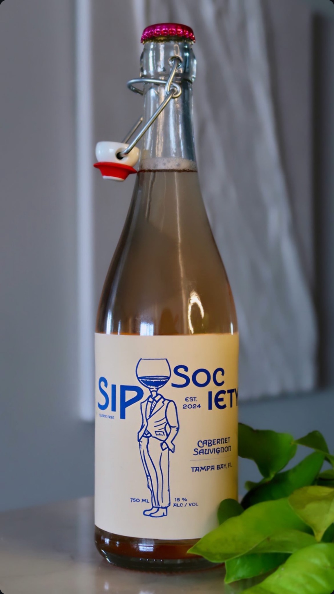
Full Sip Society bottle showing the cream and blue front label.

Core brand device

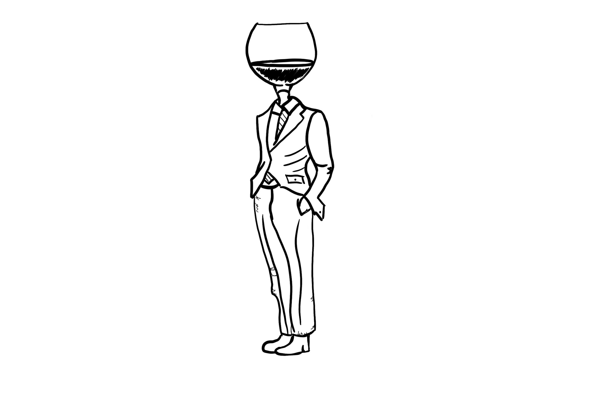
Meet the Winehead.

At the center of the identity is a hand-drawn figure with a wine glass in place of his head. His suit and tie give the character a sense of ceremony, while the surreal illustration keeps the brand from taking itself too seriously. That contradiction became the personality of the system: intentional without being formal, elevated without becoming precious.

Instead of relying on vineyards, crests, or expected wine iconography, the character gives Sip Society a distinctive visual asset of its own.

Original hand-drawn Winehead illustration for Sip Society.

Hierarchy

Create recognition before information.

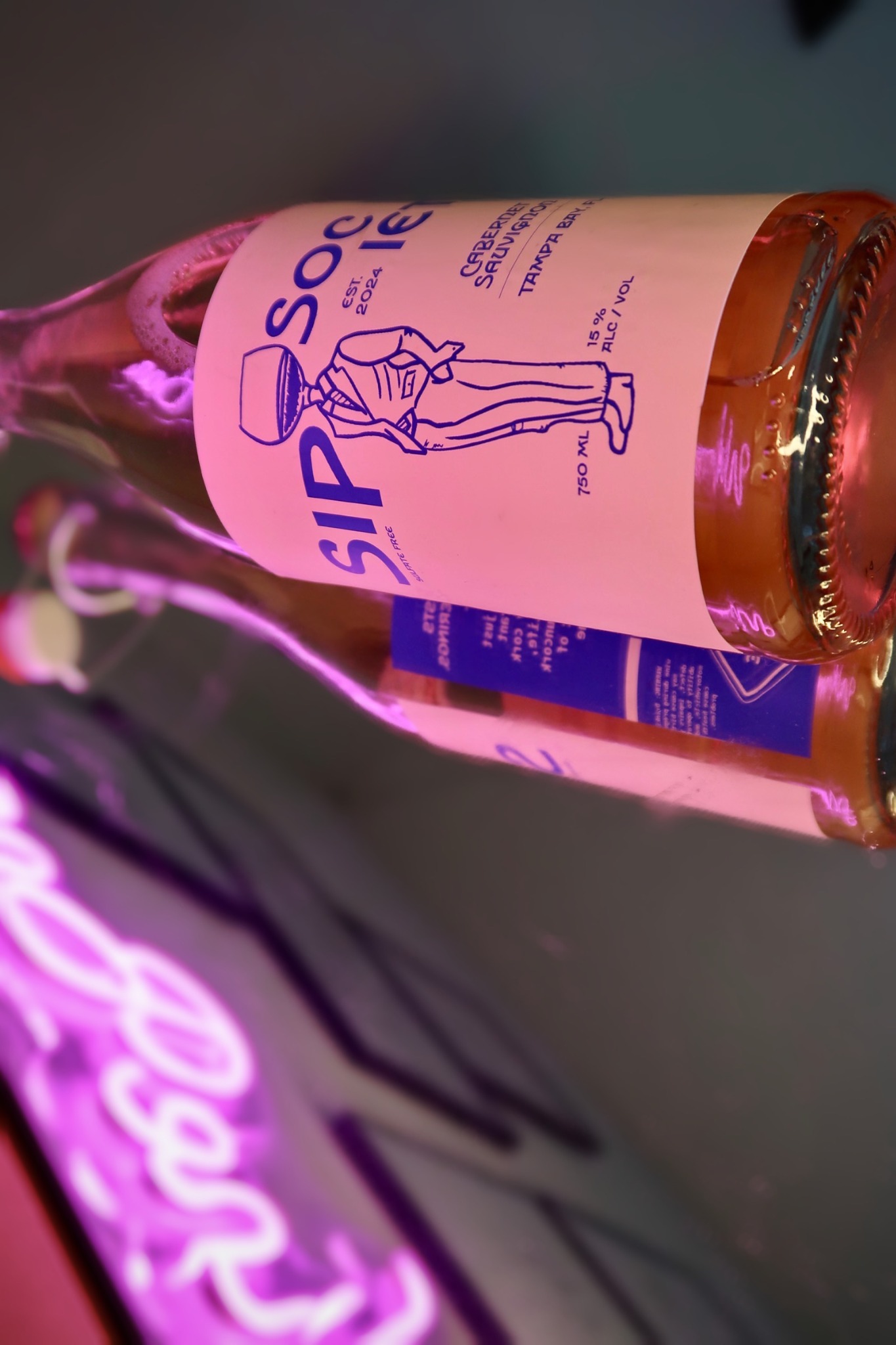
The oversized, fragmented SIP / SOCIETY typography and central illustration establish the brand before the viewer begins reading varietal or product details. From a distance, the bottle first reads as a bold graphic object. Up close, Cabernet Sauvignon, origin, volume, and supporting information reveal themselves through a second level of hierarchy.

The composition is intentionally unconventional: the name moves around the Winehead instead of sitting in a single lockup, encouraging the eye to travel around the label while keeping the character embedded in the identity rather than treating him as decoration.

Angled close-up of the Sip Society front label and Winehead illustration.

Print exploration

Finding the balance through color.

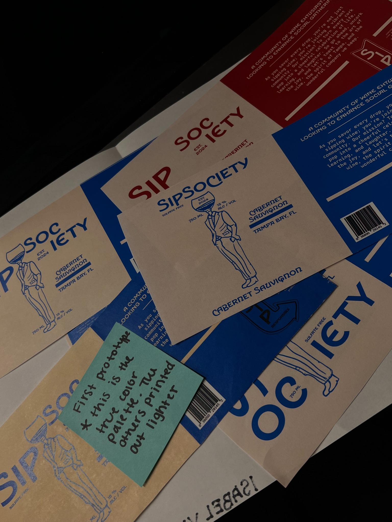
Color was treated as a packaging decision, not just a screen decision. Early prototypes explored stronger red and blue combinations to understand how the identity shifted once printed and wrapped around a physical bottle.

The final cream and deep blue direction created the strongest balance. Cream adds warmth and gives the label an understated, tactile quality; deep blue delivers enough contrast for the type and illustration to register immediately while feeling less expected than black. Together they keep the bottle minimal and elegant with an electric edge.

Printed Sip Society label iterations showing cream, blue, and red color testing.

360° packaging

Story on every side.

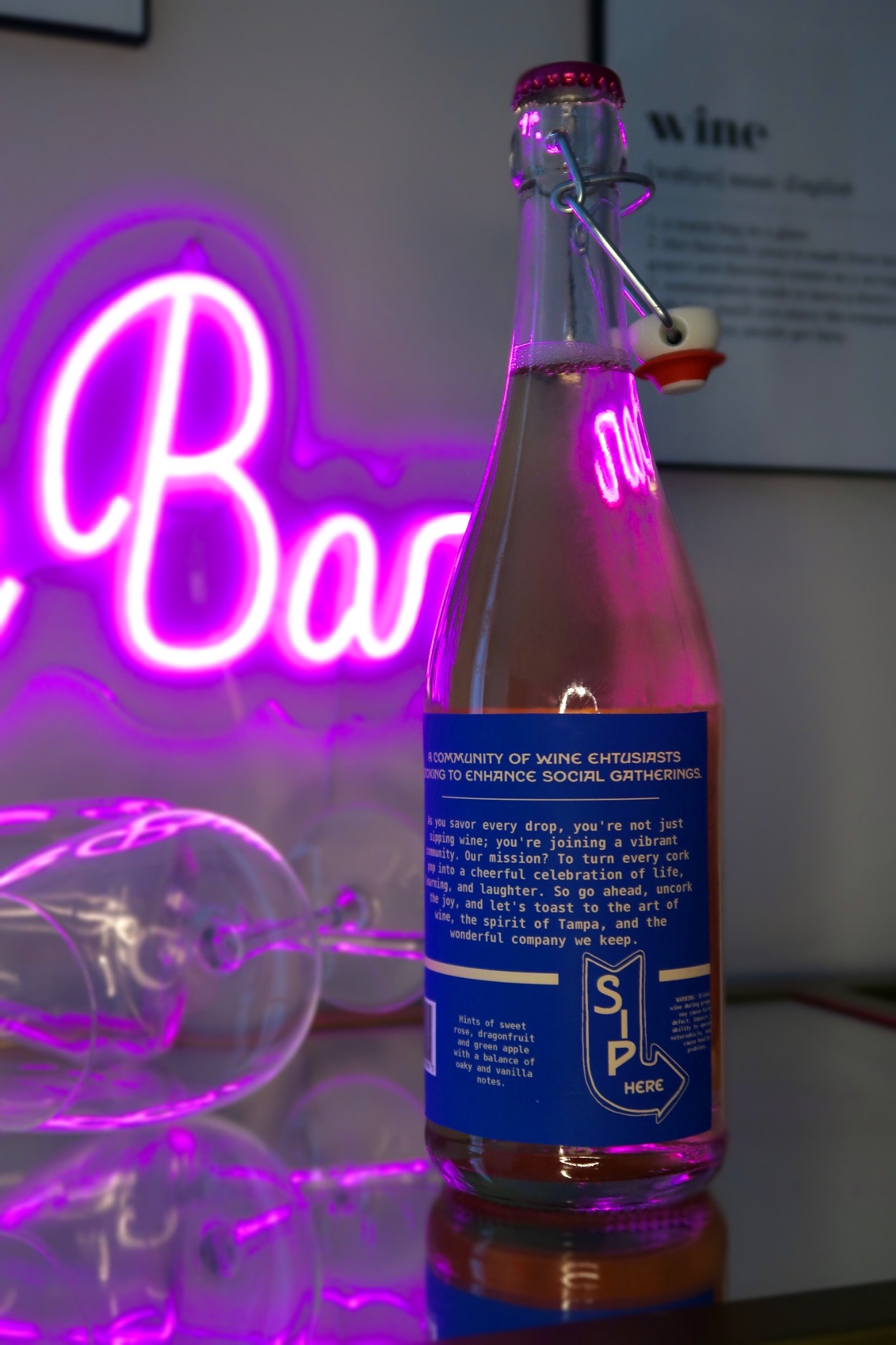
The back label extends the idea beyond a front-facing graphic. Conversational brand copy, tasting notes, and the “Sip Here” directional device turn the reverse panel into a second discovery moment once the bottle is picked up.

That mattered because the system was designed as an experience, not a façade: visual intrigue earns the first look, then the packaging rewards closer attention with voice, information, and personality.

Back of the Sip Society bottle showing brand story, tasting notes, and Sip Here graphic.

Wine shelves are visually dense. Instead of trying to become louder than everything around it, Sip Society uses a large field of cream, one saturated blue, generous negative space, and a surreal human figure to create contrast through restraint.

01

Shelf recognition

A strong cream field, oversized type, and a distinctive illustration create recognition before the customer reads the details.

02

Character without gimmick

Hand-drawn artwork introduces humor and approachability while the limited palette keeps the package sophisticated.

03

Story on every side

Front and back panels work together to move from visual intrigue to product information, brand voice, and community.

The takeaway

Packaging as a social object.

Sip Society became an exploration of how packaging can communicate more than product attributes. Every decision—from the Winehead illustration and fragmented typography to the restrained color system and conversational back label—works toward the same idea: creating something people would want to pick up, bring to a table, talk about, and remember.

The result is a wine identity built around the experience surrounding the bottle rather than simply what is inside it.

Next project

Jan’s Boutique ↗